CARRIAGE*
A friendly slab-serif typeface inspired by early electric typewriters
TYPEFACE DESIGN TYPE SPECIMEN
*Published in AIGA’s “Locally Sourced,” 2022
![]()
![]()
![]()
![]()
![]()
![]()
What is this?
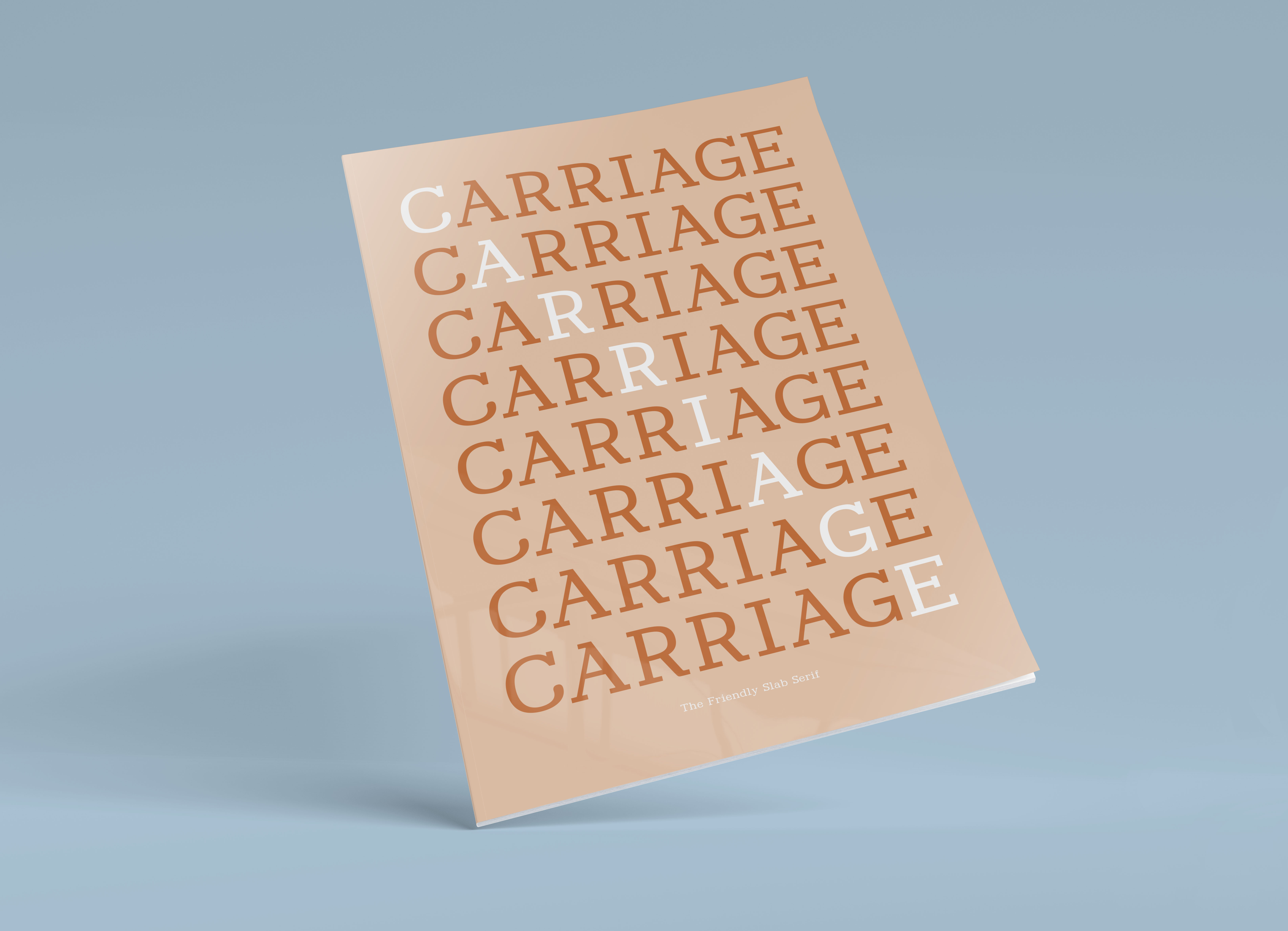
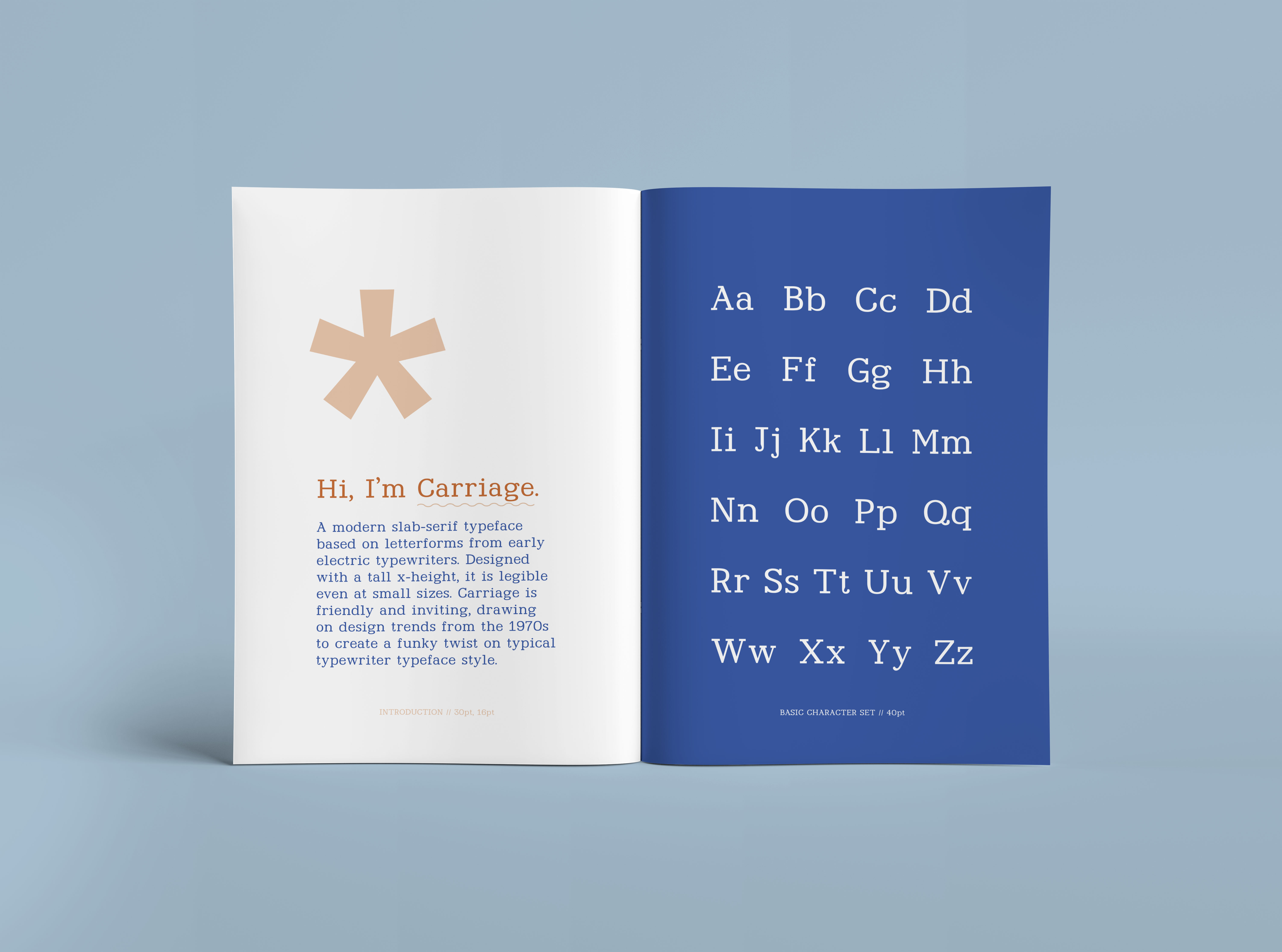
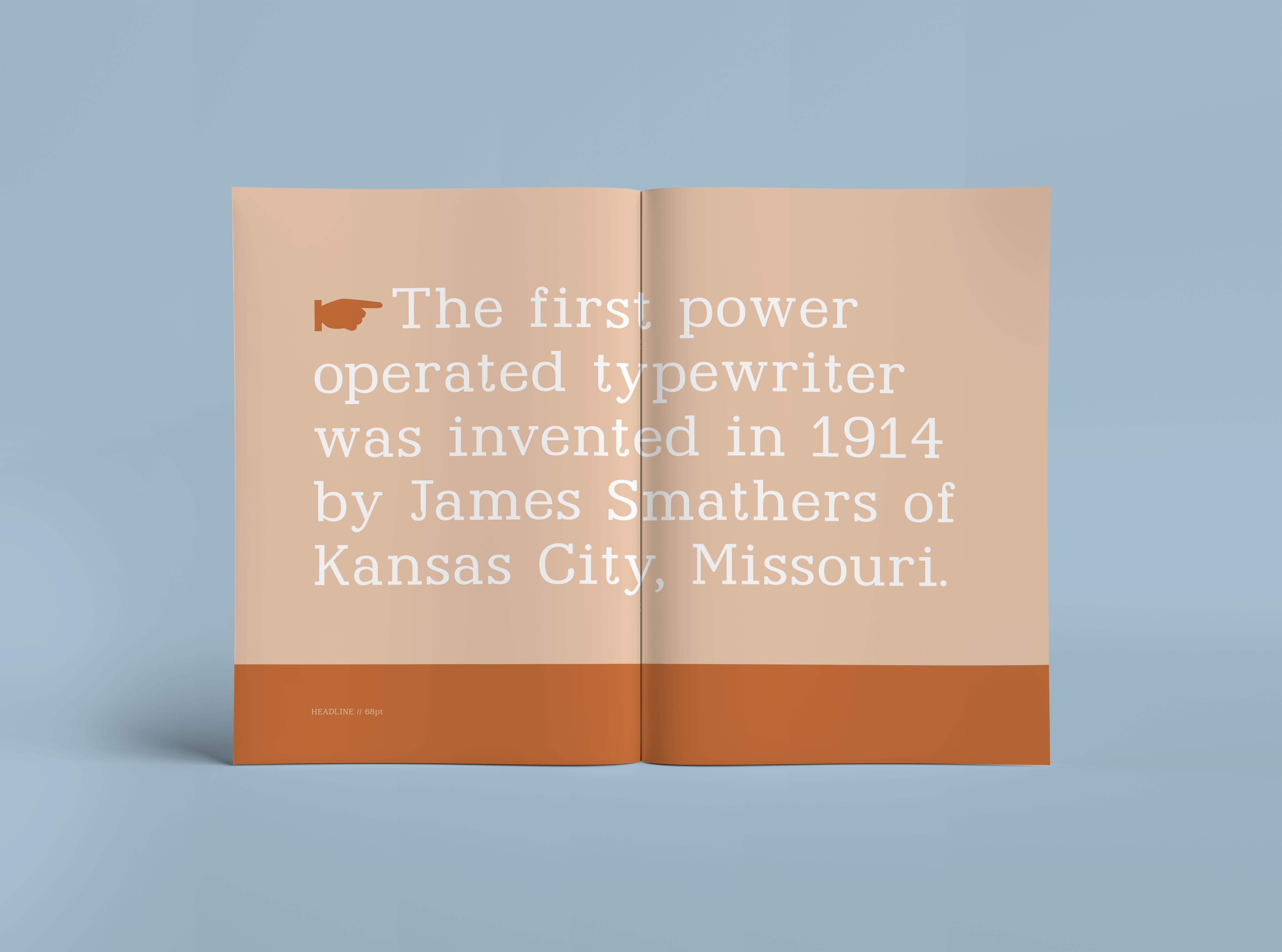
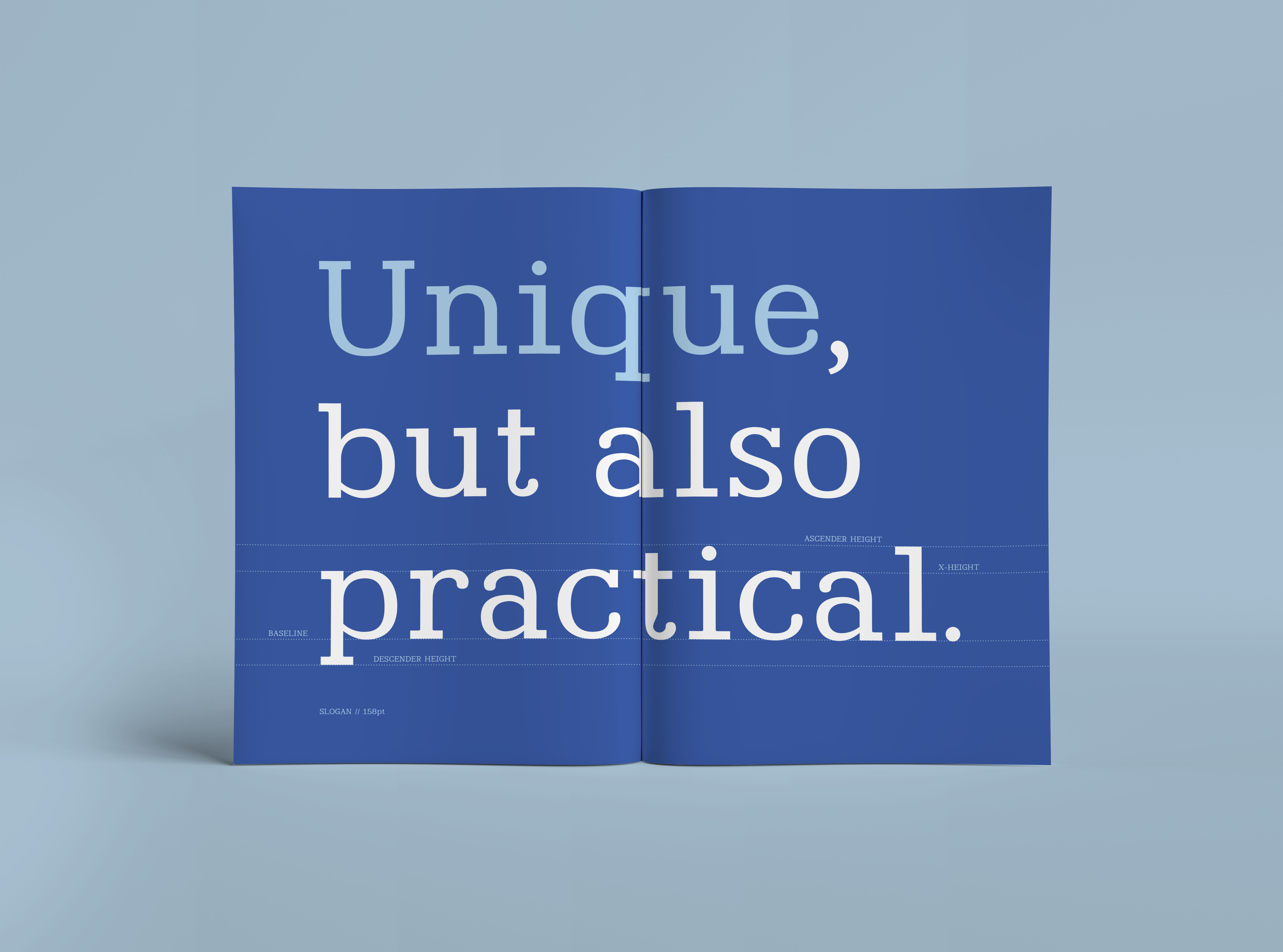
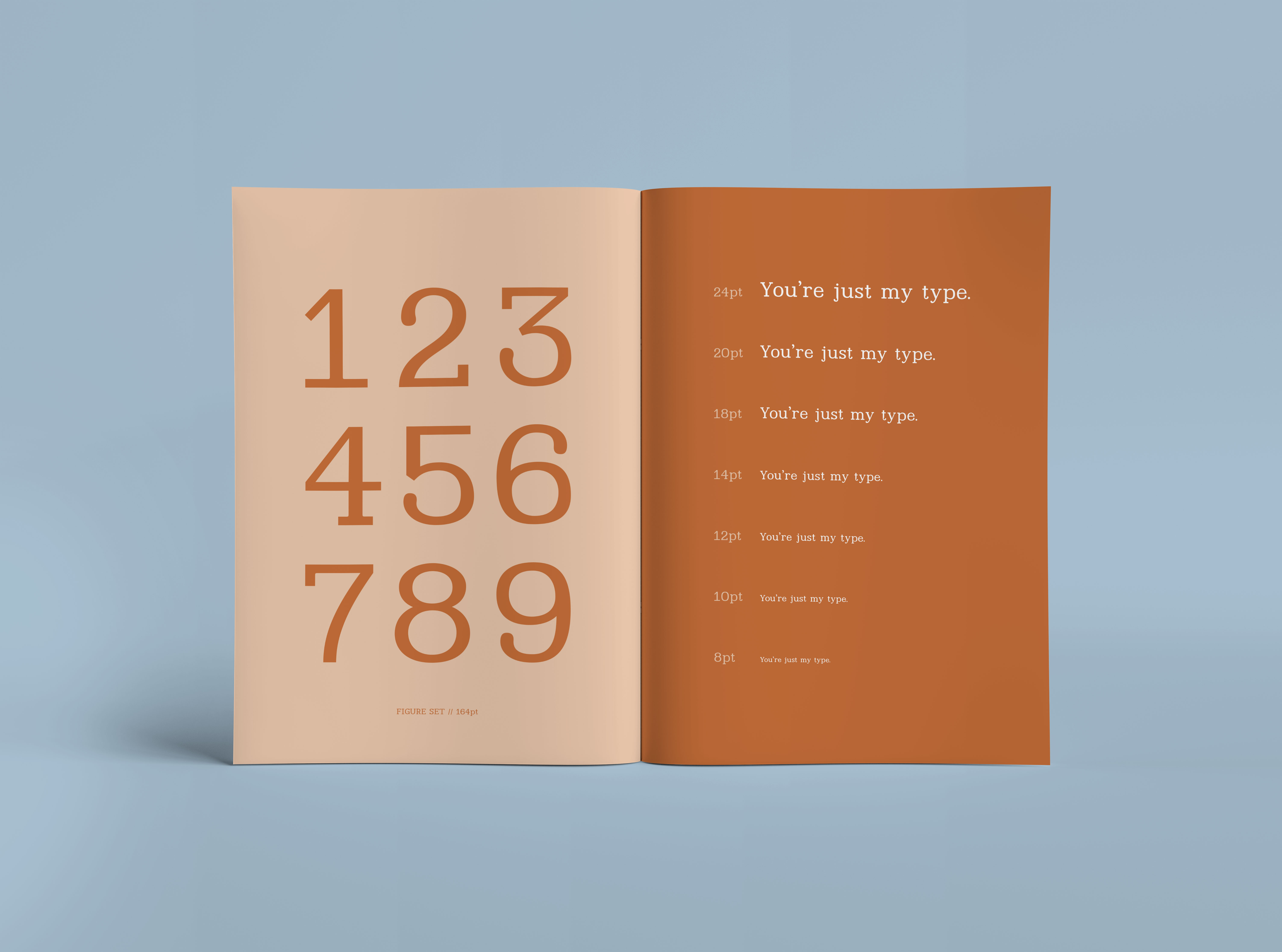
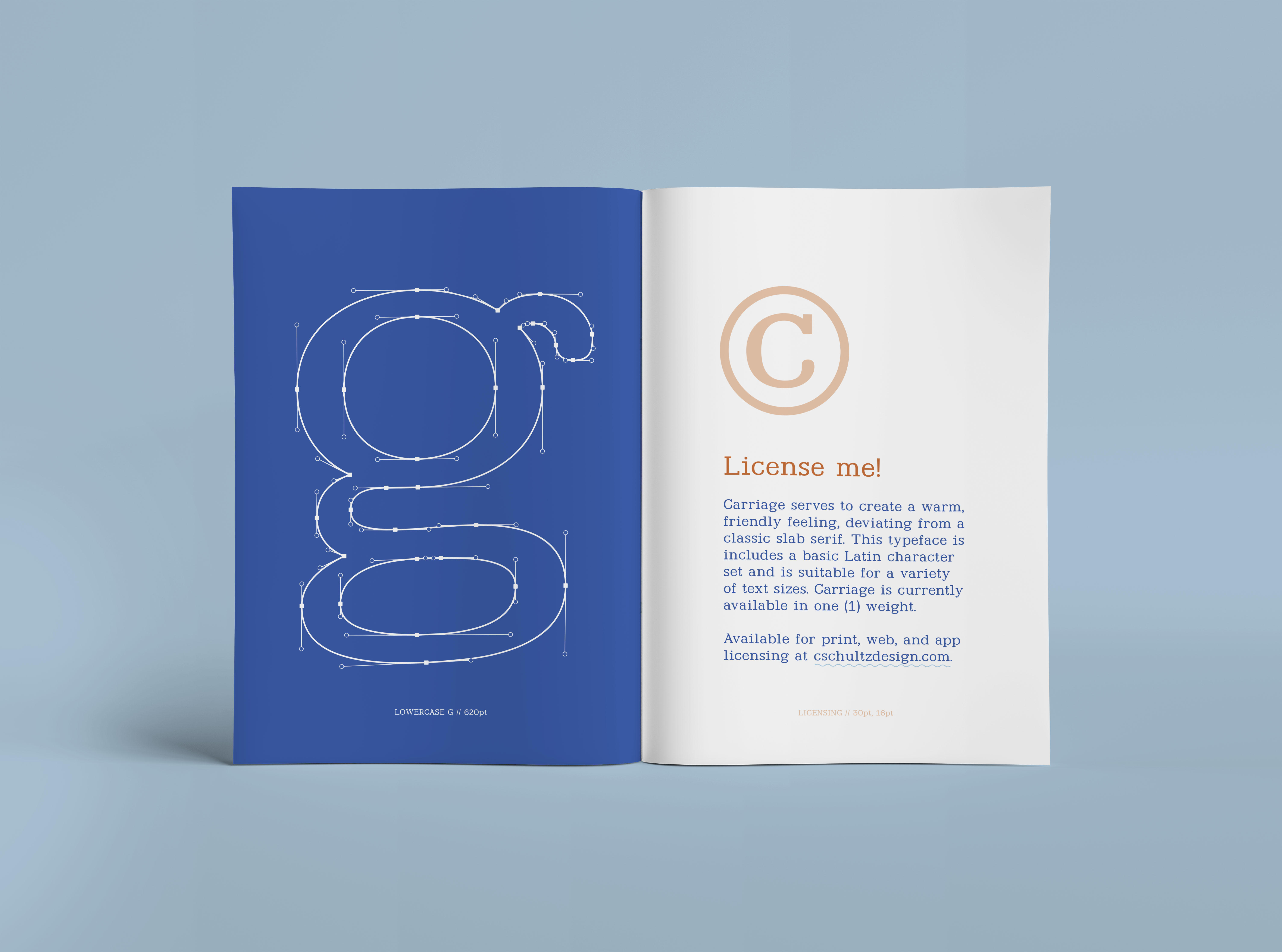
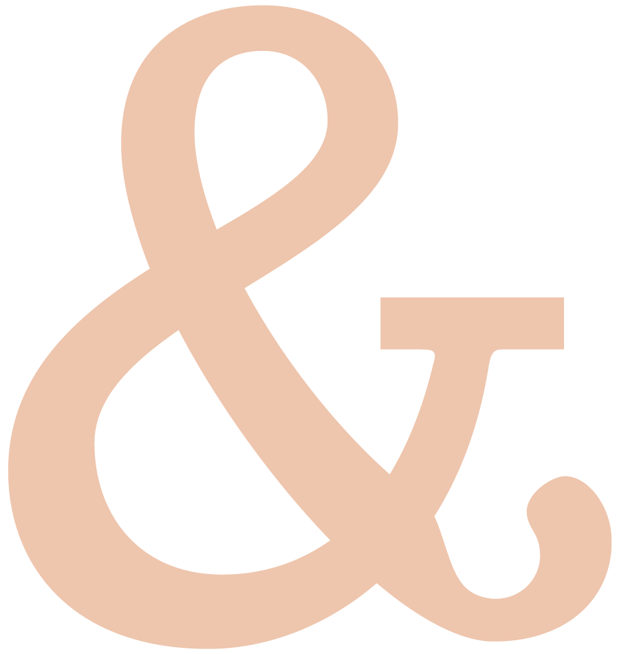
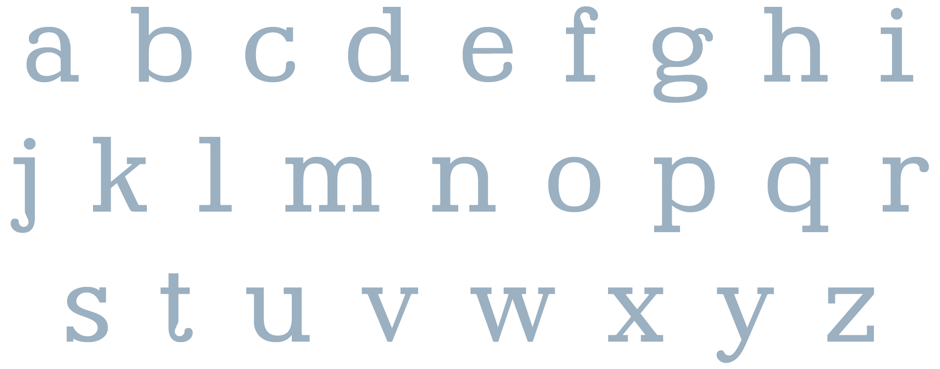
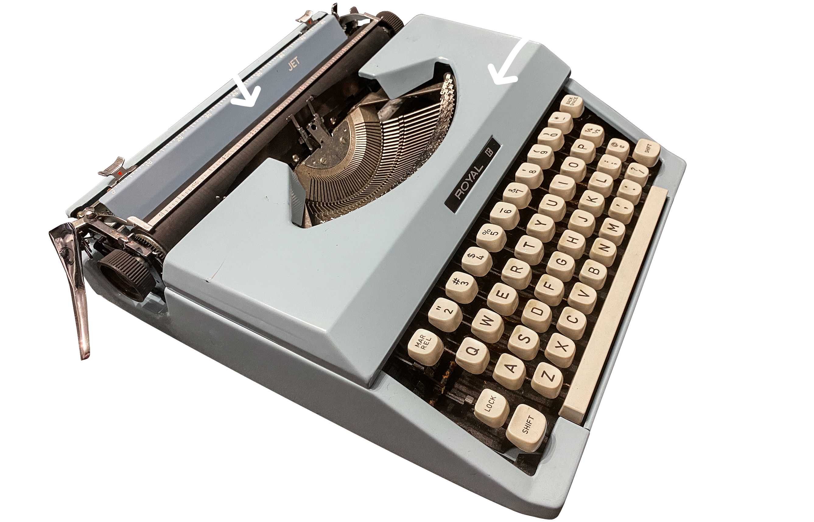
Carriage is fully-custom slab serif typeface with medium contrast and some funky ball terminals.
I took my main style inspiration from early electric typewriters and candy packaging from the 1970s.
Why?
I have always been fascinated by typewriters—the clack of the keys, the permanence and the imperfection. With this typeface, I wanted to envoke the nostalgic feeling of using a typewriter.
(And for anyone in Gen Z reading, the term “carriage” refers to the top part of a typewriter that holds the paper and moves it along as you type.)
Wiggle, wiggle, wiggle
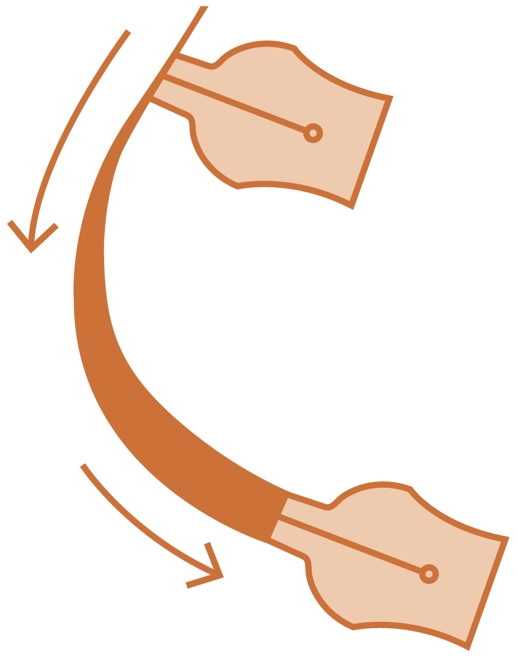
I started the process of type design by exploring how traditional type was written: with a broad edge pen. But since I didn’t have one on hand, I was able to use the “wiggle method.” This method uses two parallel pencils to mimic the 30 degree angle and thus the contrast of a broad edge pen.
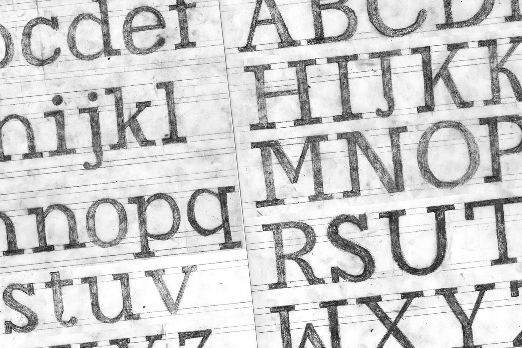
Sketch, sketch, sketch
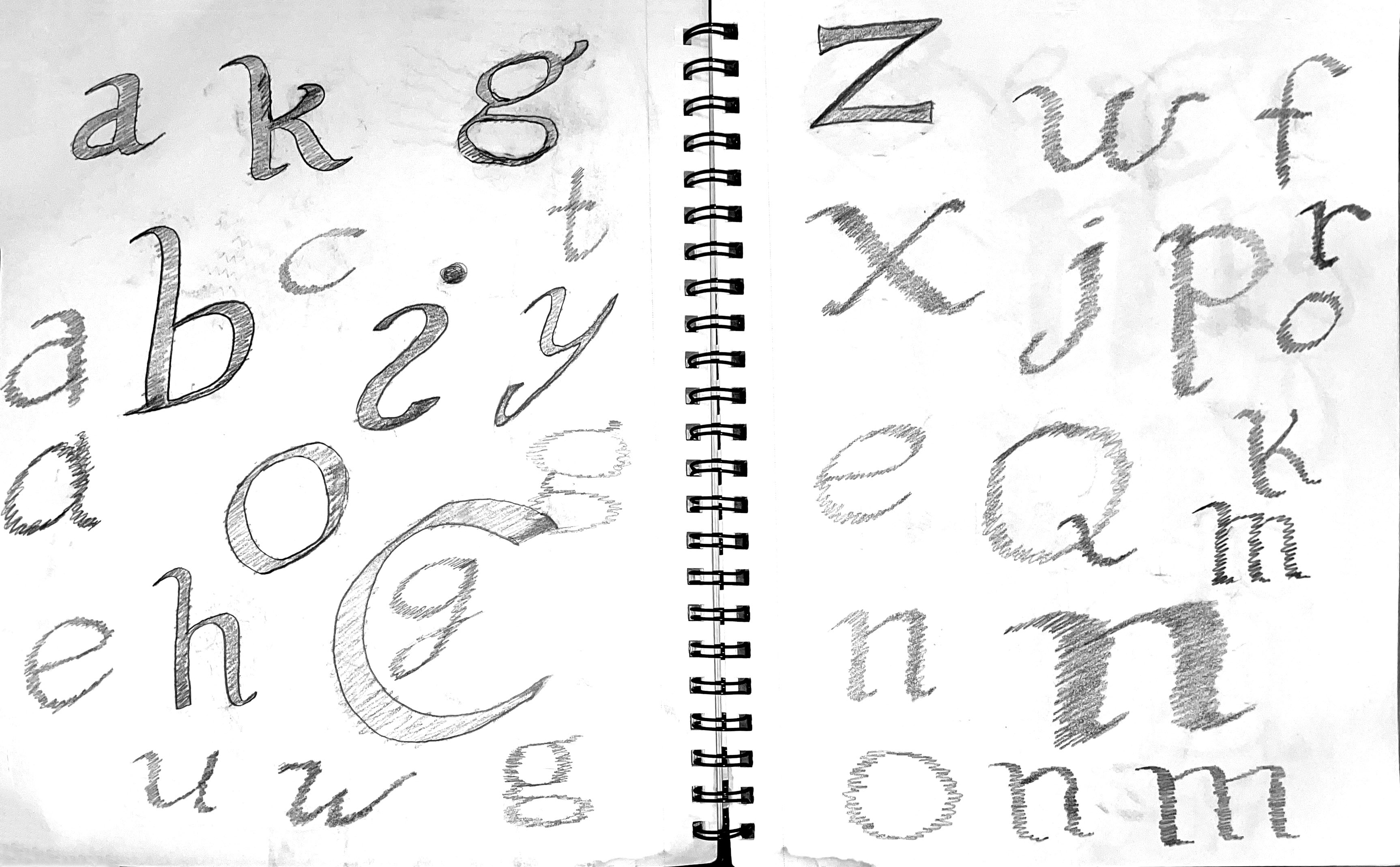
Once I had the basics down, I started experimenting with more ways of making letterforms until I landed on a specific style.


Tweak, tweak, tweak
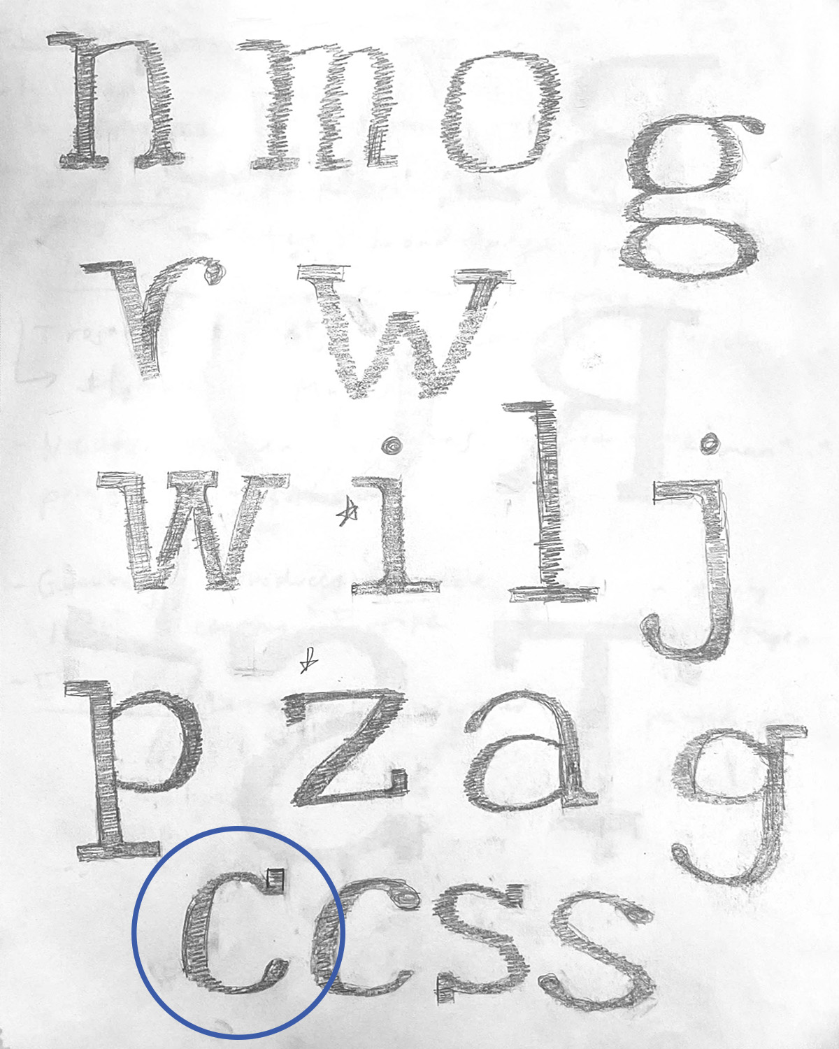
After drawing out the character sets, I moved into Glyphs to digitize each letterform. This was a long and somewhat tedious process, but it taught me the extreme intricacies of type design.

Interested in licensing?
Available for print, web, and app licensing.
Shoot me an email:
carsonschultz8@gmail.com
Credits
Concept and imagery all self-produced
Concept and imagery all self-produced
CARRIAGE*
A friendly slab-serif typeface inspired by early electric typewriters
TYPEFACE DESIGN TYPE SPECIMEN
*Published in AIGA’s “Locally Sourced,” 2022
![]()
![]()
![]()
![]()
![]()
![]()


What is this?
Carriage is fully-custom slab serif typeface with medium contrast and some funky ball terminals.
I took my main style inspiration from early electric typewriters and candy packaging from the 1970s.

Why?
I have always been fascinated by typewriters—the clack of the keys, the permanence and the imperfection. With this typeface, I wanted to envoke the nostalgic feeling of using a typewriter.
(And for anyone in Gen Z reading, the term “carriage” refers to the top part of a typewriter that holds the paper and moves it along as you type.)

Wiggle, wiggle, wiggle
I started the process of type design by exploring how traditional type was written: with a broad edge pen. But since I didn’t have one on hand, I was able to use the “wiggle method.” This method uses two parallel pencils to mimic the 30 degree angle and thus the contrast of a broad edge pen.


Sketch, sketch, sketch
Once I had the basics down, I started experimenting with more ways of making letterforms until I landed on a specific style.


Tweak, tweak, tweak
After drawing out the character sets, I moved into Glyphs to digitize each letterform. This was a long and somewhat tedious process, but it taught me the extreme intricacies of type design.


Interested in licensing?
Available for print, web, and app licensing.
Shoot me an email:
carsonschultz8@gmail.com
Credits
Concept and imagery all self-produced
